Interview
Seattle Rep's New Look and Feel
We talk with Seattle Rep's Graphics team (Shannon Loys: Lead Graphic Designer and Angela Nickerson: Creative Director) about the organization's new brand!
What is a brand, and why did Seattle Rep decide to update its brand this year?
Shannon: A brand is a company’s identity, how it presents itself to the public. Logos are typically what come to mind when people think of a brand, but color palettes, typeface, and voice are also part of a brand.
Angela: The last time Seattle Rep updated its brand was back in 2010, so we had been feeling for a long time that there was a mismatch between our programming and what we were putting out there—our colors, logo, and personality. Our brand hadn’t kept up with what was already happening inside the building in terms of changes to our mission, vision, and values. Seattle Rep is a theater for everyone and we wanted our brand to reflect that.
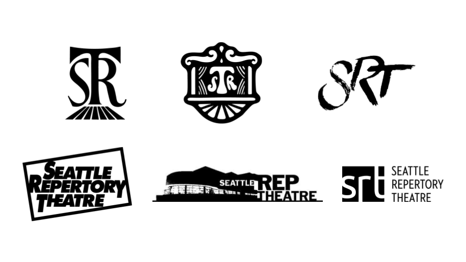
Seattle Rep's logos through the decades
What does it take to develop and design a successful brand? How did this process play out for Seattle Rep?
S: You need a "big picture" strategy to successfully launch a new brand, so Seattle Rep collaborated with an outside agency, Northbound, to do research and conduct focus groups. Their outside perspective was invaluable. They helped us identify how, historically, Seattle Rep may have unintentionally communicated that theater is elite, or unwelcoming. And with the focus groups, we wanted to know, “What do people think of when they think of Seattle Rep? What do they think of our new vision statement—theater at the heart of public life? Are we living up to that?”
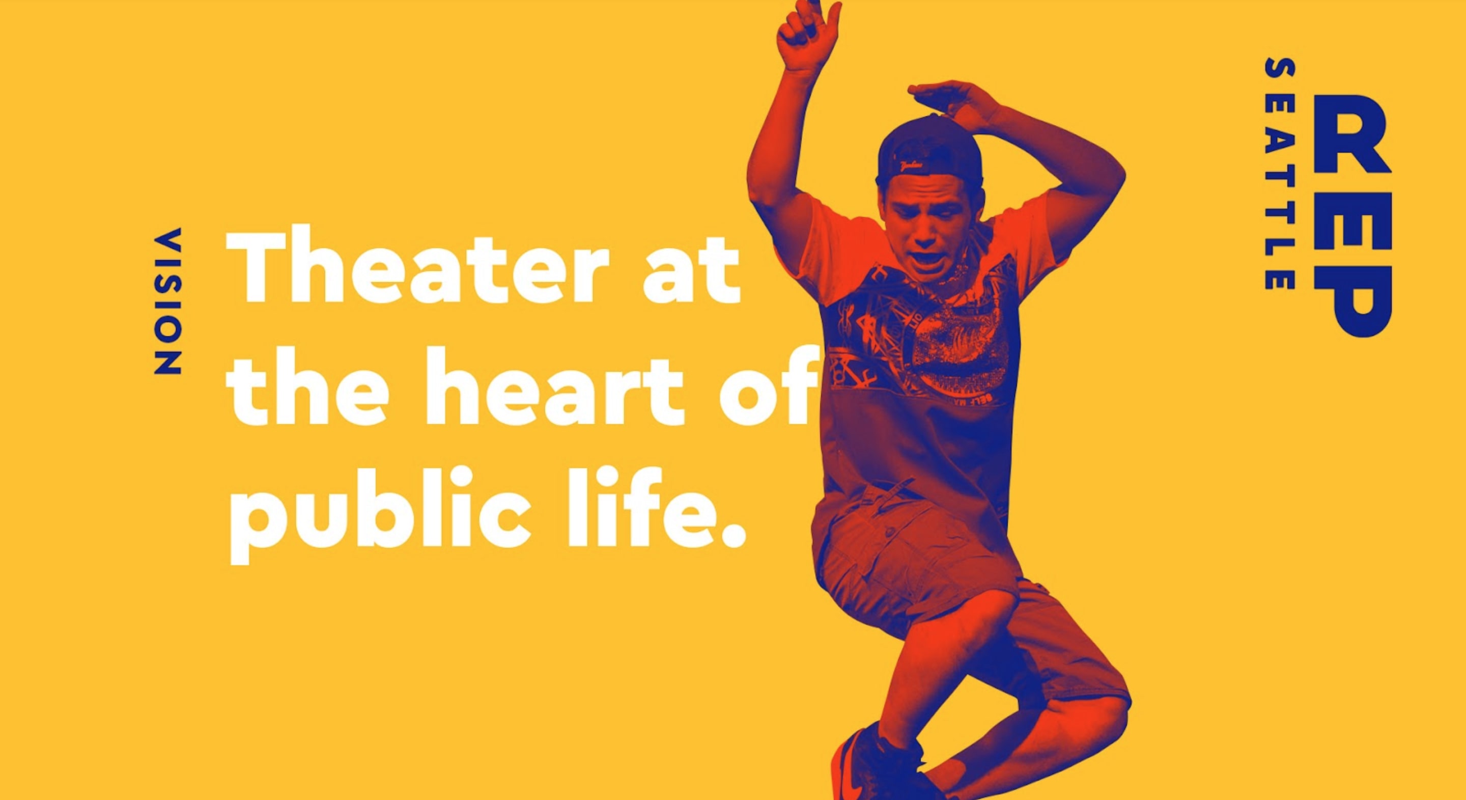
"One thing was clear from the focus groups: people are excited about our new vision statement 'Theater at the heart of public life.'"
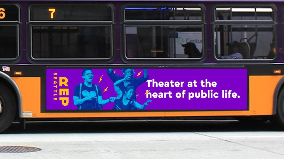
A mock-up design of the new brand on a bus.
A: We held six different focus groups bringing together subscribers, single ticket holders, people who attend other theaters, and people connected to Seattle Rep’s Public Works program.Their response gave us the confidence to focus on that statement visually, using it as the heart of a big ad campaign because it resonated so strongly with every single focus group.
How does the new brand visually communicate Seattle Rep’s mission, vision, and values?
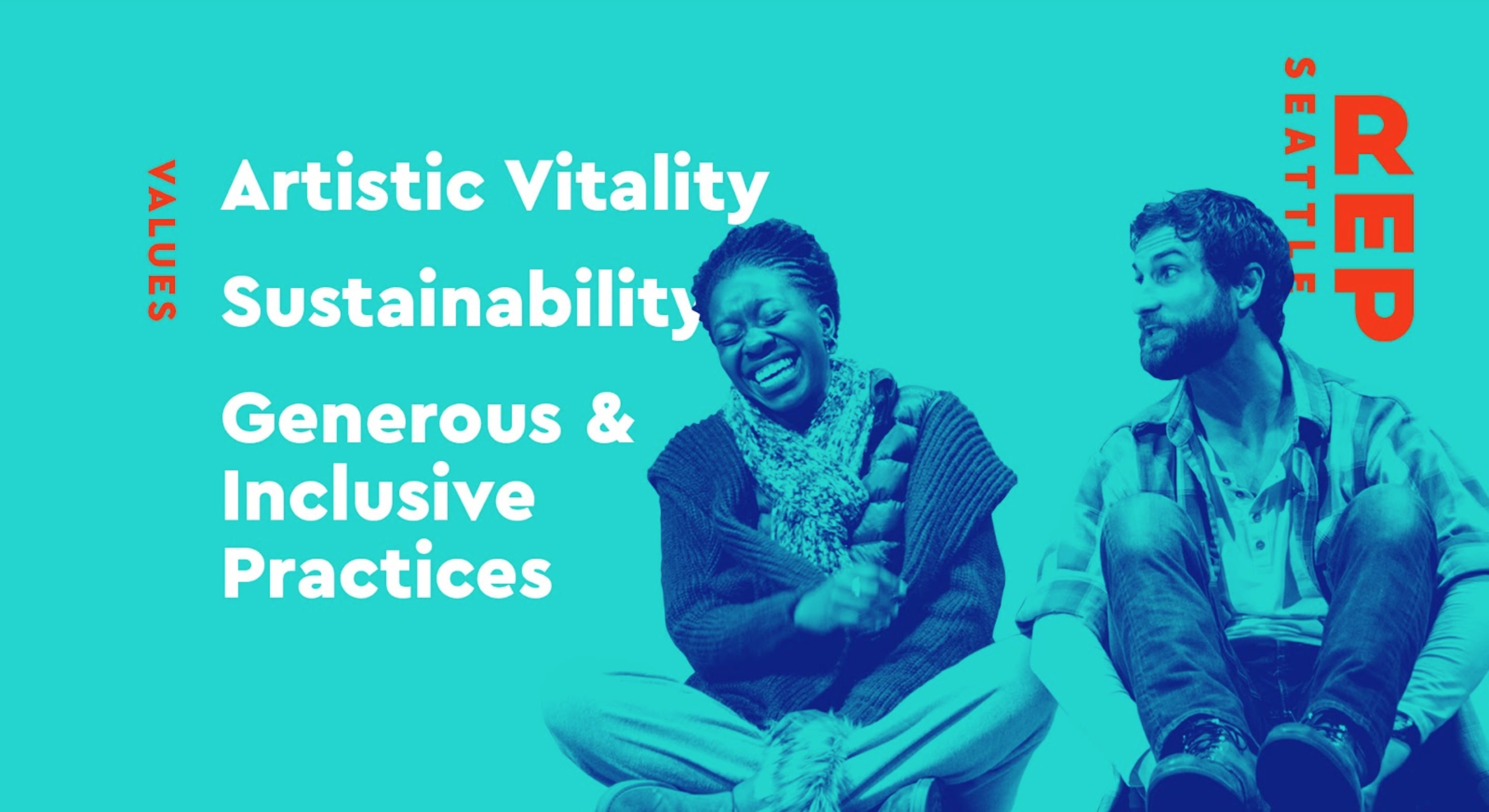
S: The new brand is all about visual friendliness and inclusivity, focusing on photographs with lots of different kinds of people. We have a brighter more energetic color palette and our new logo is bold and legible, not complicated or overly conceptual. We also cut the full word “Repertory” and the word “Theater” from our name —acknowledging that people already call us “Seattle Rep” seemed like another way to invite people in. You call us Seattle Rep, and in fact we are Seattle Rep!
On our new posters, the type interacts with a strong central photographic subject, creating levels in front and behind, which gives us a sense of motion, maybe even an allusion to scenic levels on a stage?
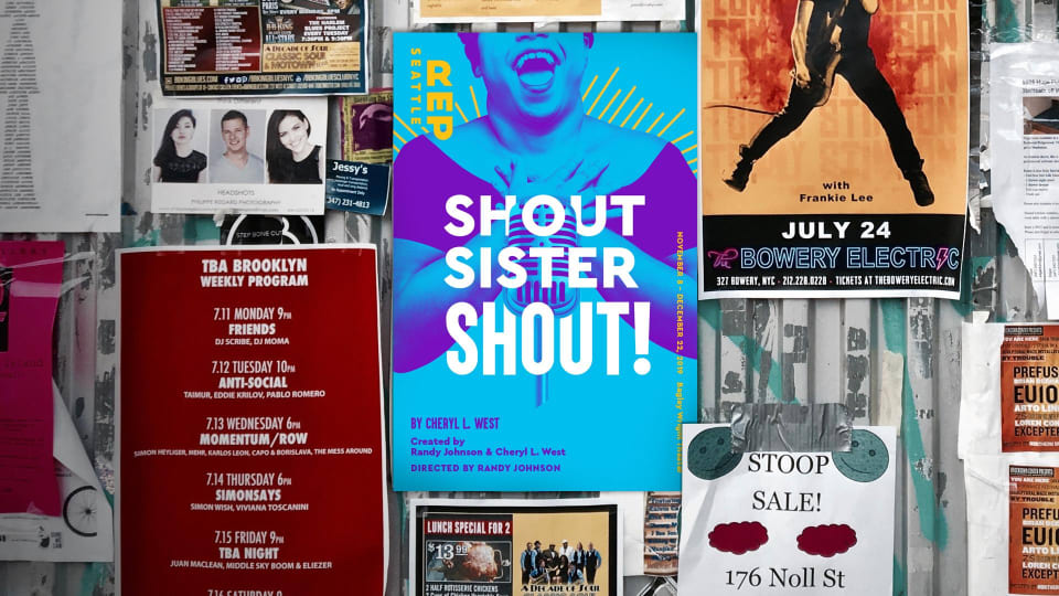
A mock-up of a Seattle Rep poster out in public.
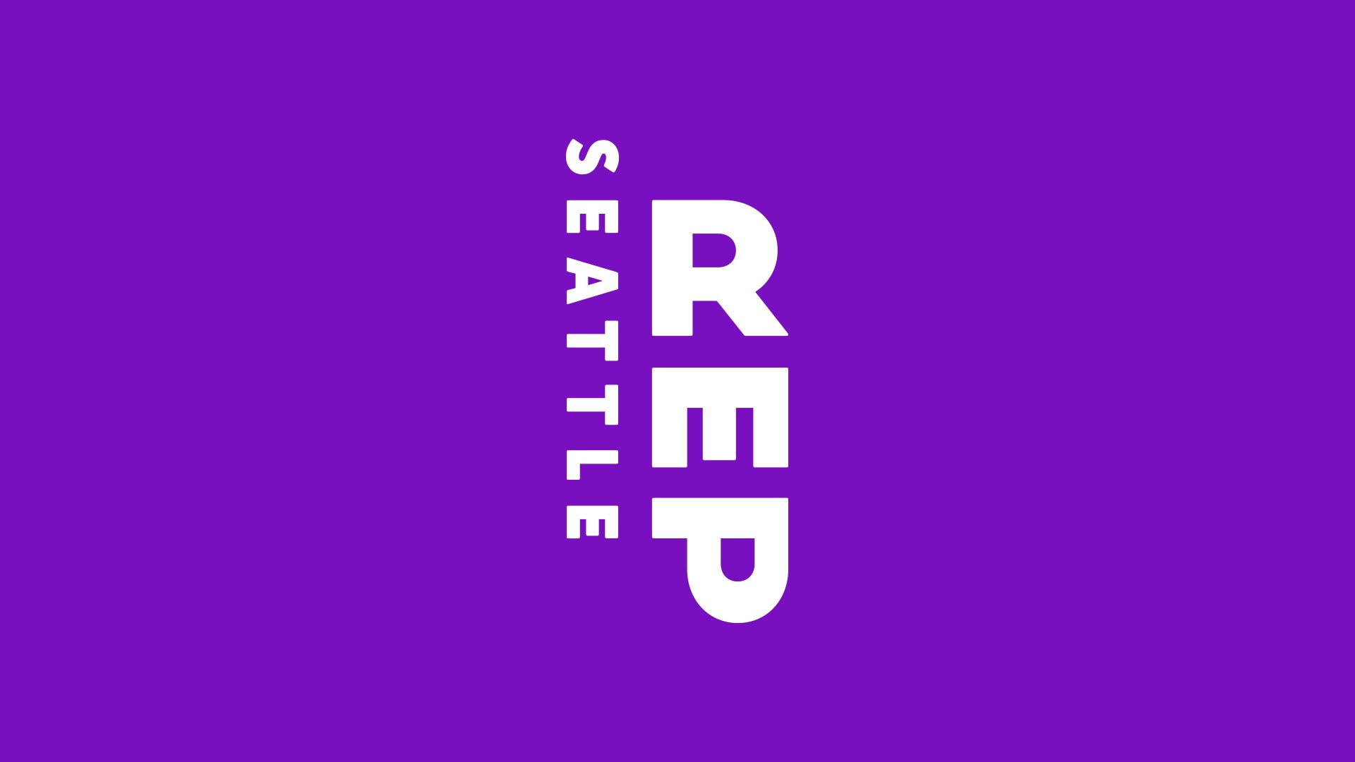
We really love the verticality of the new logo. It reminds us of a traditional theater marquee sign. And rotating the "E" and "P" communicates something unexpected: "maybe there is something new happening at Seattle Rep."
How will Seattle Rep patrons see the brand reflected throughout the organization’s materials and programming?
S: Keep your eyes peeled for a city-wide ad campaign that begins in August and lasts into the fall. You’ll get to see the new brand in action! A city take-over!
A: It will be a big overhaul, but we are finally matching our appearance to what is happening onstage. Seattle Rep has been around for a long time and it has quite a history, but we want patrons to see what is happening here now, and with this big new campaign, we hope people will take a second look.